Tuesday, November 8, 2011

Chinese Landscape Scrolls

 
7th graders´ Social Studies curriculum focuses on Asia and so does their art program. They have explored Hindu Mandalas, Chinese Dragons and Beijing Opera Masks and recently we had a chance to try out some landscape scroll paintings.

For homework they had to research the main characteristics of these paintings and frequent subjects (cherry and blossoms, waterfalls, bamboo, and chrysanthemums)  and later in class they tried watercoloring their own designs based on these characteristics.

They are all very beautiful, but these are some of the ones that looked the most "chinese" ;-)


Haida Indians Masks

  
5th graders are studying the U.S. and Canada in their Social Studies classes, and they love all things Native American, so for Halloween I had them create masks like the Haida Indians of the Pacific Northwest Coast. They first had to research these masks in the internet and bring in examples. In class we compared them to see the common features. We saw that they all had very bushy eyebrows, the eyes were pinched at the end, like footballs. Also, we saw that the lips were rounded and looked like two hot dogs, and that they covered all the negative space with designs.

The first week we taped cardboard triangles on paper plates to create a nose shape, and covered the entire thing with papier-maché (no need to say how much they loooved doing this).


The following week they brought in sketches they had made and painted their masks, just in time for the school´s Halloween fair. I have to admit I´m quite impressed with these, they are so much better than I had anticipated—and, mind you, my expectations for this group are very high ;-)


Monday, November 7, 2011

Recycled Material Sculptures

It is with great, great pride that I finally post some of the sculptures 10th graders have made using recycled material. This project is from a unit on New Medium that I love teaching because the inspiration for it is one of my favorite artists, Vik Muñiz. Vik creates art using non-orthodox materials like cotton, wire, chocolate and even garbage, proving that art really is everywhere.

I start the unit by playing his Ted Speaks lecture and students oooh and aaah over his work (seriously, it´s amazing). We discuss how in postmodernism representational art is no longer limited to traditional medium or skills like drawing and painting, but creativity and originality are valued higher. Their assignment is to create sculptures using material they had never worked with before, except this year I gave it a twist—the material must be something which would have been thrown away, like old newspaper, plastic bottles, candy wrappers, etc. To make it even more challanging, the material must hold a relationship with the object they are representing (for example, last year a student made a doll out of newspaper, playing with the concept of a "paper doll"). And of course, applying the principles of design.

Oooh, and as if the project weren´t hard enough, I pushed them an extra mile by having them write an Artist´s Statement to accompany their work.

I´m trying to figure out how to upload them all without making the post too heavy, but in the meantime here are some of them. I am so thrilled and impressed with these kids, you can see why :-D


This one is called "Sweet Dreams" 

This one is "Haute couture rempli d´odures" and has a killer artist´s statement

This is a TP roll giraffe

A heart made of things that damage it

Another trash dress, this one made out of shopping bags and tags

This quirky piece is intended as "a funny critique to the daily invasion of all the junk published in newspaper"

This piece has got one of the best artist´s statements I have ever read, I´ll find a way to share it soon

"The hen that laid the rainbow eggs". Breathtaking!

This one is called "The Trash Fairy" and in her statement the artist explained it was inspired by her neat freak mom.

This one is deeply conceptual and is titled "The Americanization of the Dominican Republic". Brilliant!

This is the cutest self-portrait i´ve ever seen :-)

Cotton swans—soooo lovely

This one is the little kid´s favorite—Jack and Sally from Tim Burton´s The Nigthmare Before Christmas. Made from chocolate bar wrappers! These kids are too much :-D

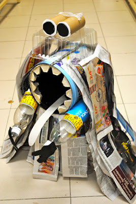
The Trash Monster!

A magazine lamp. Started out as a basket but I asked her to push it further...it´s still not finished though, I suggested some alterations

*If some of the images don´t load, click on one too see them all

Saturday, November 5, 2011

Gallon Goblins for Halloween

A couple of weeks ago 6 III was working on recycling the crayon stubs from the Art Room, but 6 IV had a different task: They had to create something using empty plastic gallons which used to hold paint and glue. First, they covered them in Papier-maché newspaper.


The following week they did it again but using white paper so they could paint over them.


When they had dried, I left it up to them to design their own creations. I showed them some ideas from the internet for inspiration. Since Halloween was coming up, they all decided to make these little monsters, jack-o-lanterns or goblins. Super cute! Some used them for trick-or-treating and others were borrowed as decorations for the Halloween Fair at school.

Wednesday, October 26, 2011

Pop Art it is!


The winning modern art movement from last week´s assignment was POP ART (congrats Marlene and María, great job!), so this week´s assignment will be based on the work of it´s most notorious figure, Andy Warhol.

This will be a three part assignment which we will complete between this week and the next. The first part is written; Today I will hand you will a magazine article about Andy Warhol. After reading, I want you to extract 10 sentences with the information you personally found the most interesting, as well as answer the 3 questions that are on the magazine.

Also, check out the websites mentioned in the magazine to look at his work. Choose 3 different pieces and tell me why you like them or not (proper lexicon, please. Mention elements and principles of art). Email me your sentences, images and answers.

While you are reading, I will go around taking your picture. By the time you are finished, I will give you your digital picture and you will begin the second part of your assignment, which is to digitally manipulate it in photoshop to create a silkscreen print effect. Follow this tutorial. You´ll love it, it´s super cool :-). Email me your pimped up photo in jpg format.

Next week is the final assignment. You have to print ONE SQUARE (not all four, just ONE) of the photo in 8.5" x 11", prefferably in color but black and white is acceptable, and bring it in to class. We will create a lithograph using these, but this I will explain next week. If you do not bring the printed picture you cannot work, so DO NOT FORGET.

Good luck, and get to work!

Friday, October 21, 2011

Optical Art: Lines like Bridget Riley


A unit on Optical Art is always a big hit with 5th graders. I love it because non-representational art is fun to look at not too intimidating to make, so students who are not that skilled at drawing often surprise themselves by creating a wonderful piece. For this project, students studyied the life and work of Bridget Riley. I chose her because:

1) Students are not too familiar with women artists (and they should be!)
2) Her work is mostly composed of abstract line compositions and the elements of art are very easily identifiable
3) She was an art teacher too ;-)

On the first lesson we saw some cool optical illusions and defined the term. The next day we saw Bridget´s work and students were handed black construction paper and colored chalk to create similar composition —basically, parallel curved lines to create the illusion of movement. A very basic assignment with very different results. Here are some of them:


Then we took it a step further by working with shapes and complementary colors to make it pop out more. Like these:


Finally, the best part is when students go outside the box and apply what they learned to create completely original compositions, such as these:


We are currenlty woking on some Victor Vasarely checkerboard radials. Will post as soon as they´re finished, i´m sure they´ll be just as awesome :-)

Wednesday, October 19, 2011

Recycled Crayons

In the Art Room we had tons of tiny crayon stubs which were too uncomfortable to color with, but it seemed very wasteful to just throw them away. Since this month the school is working on recycling projects, 6 III was the lucky class who got to make these cute crayon-cakes (not edible though!).

First, students worked hard sorting out and peeling the labels off of all the stubs from dozens of boxes. I have no idea why, but they actually found this a lot of fun!


Afterwards, the restaurant lent us muffin pans and each student filled a foil cup with their color combinations. We disscussed previously which colors worked well together and how it might turn brown if too many different colors were added. When the pan was full, we took it up to the restaurant where they "baked*" them for us.


The next day, after they had cooled and set, everyone got theirs. Super cool!


* Basically, they have to melt in an oven for about 8 minutes. Another way of doing this is to melt them in a container and then pour onto molds with shapes. I´m trying to get some chocolate molds for the next edition of this project...

Tuesday, October 18, 2011

Sculpting heads out of Play-Doh


9th graders are finishing a unit on prehistoric art and we are gearing up for a clay workshop. Their assignment is to create an idol statuette, sort of like the Venus of Willendorf, but of their own design. In the meantime, we had a trial run the other day using Play-doh. Following a You Tube tutorial, they had to sculpt tiny heads. I love this project because they get to loosen up a lot and the soft, malleable material allows for very expressionist creations. Here are some of the most creative examples.


Monday, October 17, 2011

What 8th graders are up to...

I haven´t posted any 8th grade projects because they are currently working on a big one. Since they are working with the Cartesian Plane in their Geometry class, I figured Grid Drawing would be appropriate.

First, we researched American artist Chuck Close. Students were handed, in pairs, a chapter of his biography which they had to summarize and present to the class. They learned how Close overcame his mental and physical disabilities and developed grid drawing to help him create his massive portraits. Next, we did some simple lineart grid excercises to help prepare for the BIG project: A value self-portrait using a grid. I took their picture (they all hate theirs but at 14 everyone hates they way they look anyways) and used Photoshop to enhance the tonal value. They created a big grid and began copying and enlarging their photos.


By this week most students have finished with the line drawings and next week will begin painting using only 4 shades of gray. They are doing great so far, here are some examples. I will post the end result when they are ready.

Thursday, October 13, 2011

Principles of Design

Some high school students´ results from this assignment. Awesome!


Patchwork quilt

10th graders are studying colonialism in U.S. History, so in art class I proposed creating a patchwork quilt between all of them. They had to apply the principles of design to create a textile inspired by nature (although it could be an abstract motif). After everyone designed theirs we joined them together to create this beautiful paper "quilt".

I am so impressed with their individual designs that I am suggesting they create a patter with them and have them printed using this webpage. If they do (and i´m really hoping they will) I will ask for a square of fabric from each so we can create a real quilt :-)

*if you click on the image you can see an enlarged version of it

Saturday, October 8, 2011

Matisse Cut-out collages

It´s so hard to choose student work to post. I have approximately 50 students per grade level, so every project gives me around that many works to choose from. Sometimes they´re all so wonderful i hate to leave some out, as is the case of the 6th Grade Matisse Cutout collages.

6th graders had been learning about the Elements of Art in during the first unit and were ready to put their knowledge into practice. I chose to showcase French artist Henri Matisse for them since they are studying Europe in their Social Studies classes. We started the unit by reading and disscussing his biography, and discovering why he developed his "painting with scissors" collage technique. Next, students had to create their own cut-out collages using construction paper as paint. They made their sketches with both organic and geometric shapes and distributed them on their canvases, sometimes overlapping, considering positive and negative space. The different sizes and colors created very interesting texture.


I wish i could post all their work because they are seriously wonderful, but the longest blog post ever. Here are a couple chosen at random so i wouldn´t feel biased ;-)